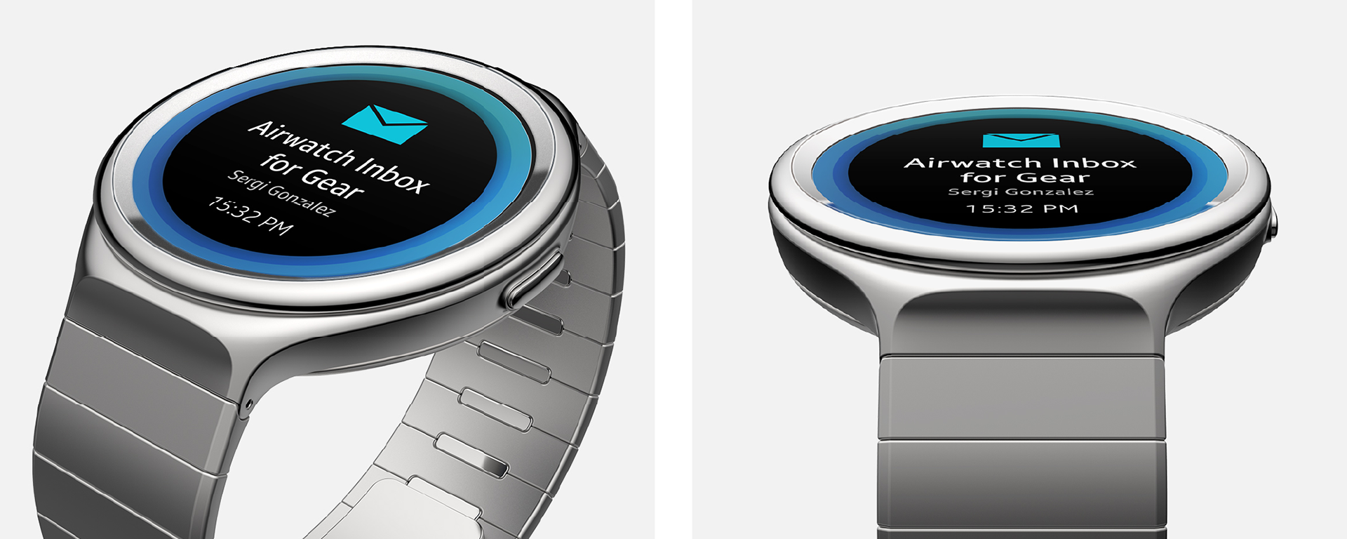
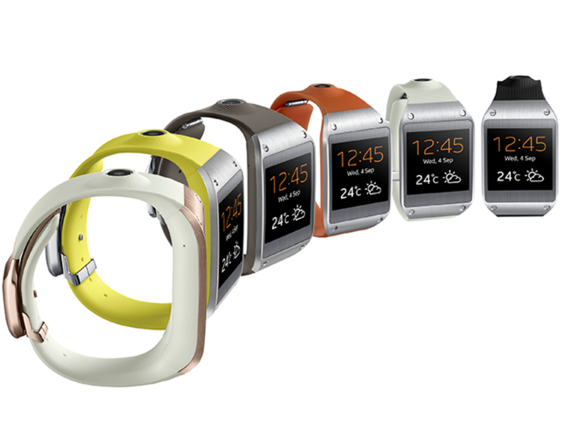
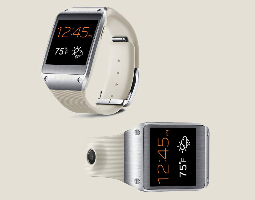
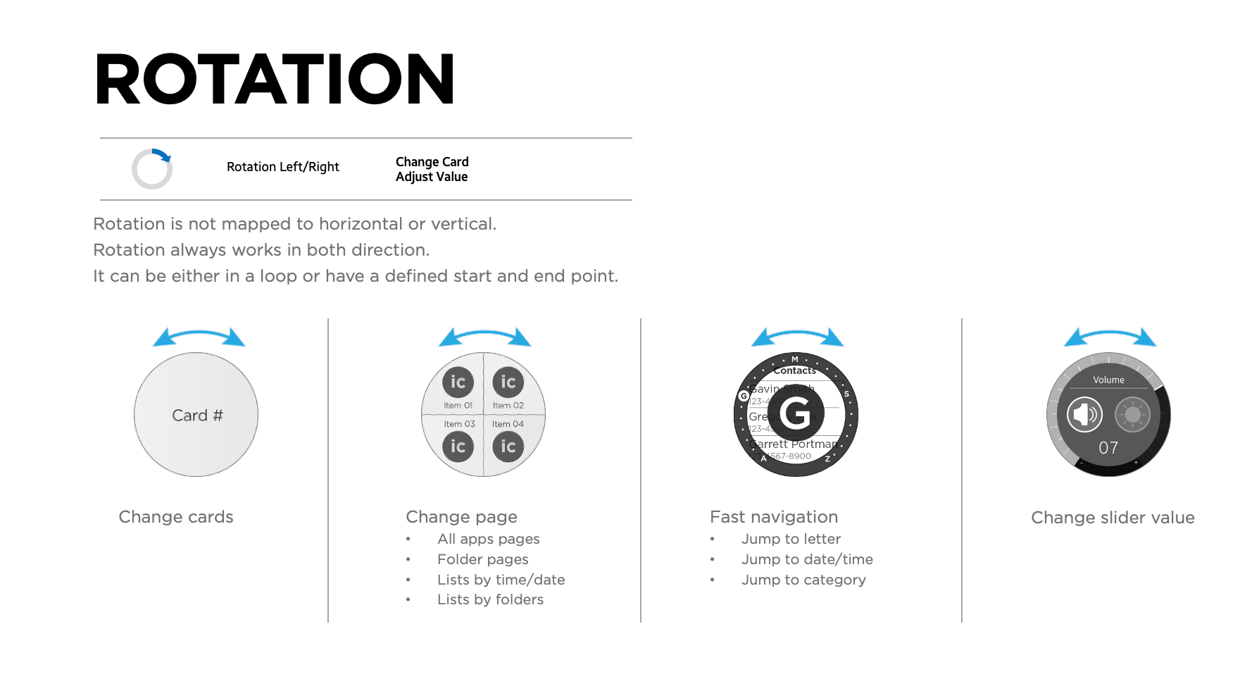
Samsung Gear S2 is the world’s first true-circular display smartwatch with a rotating bezel. With the turn of the bezel, users can intuitively interact with the content on the small display without covering it.
My Role: UI Architecture, User Experience Design, Art Direction
Business Case: "Defining the Standard" and "Cross-Functional Handoff."
Business Goal: Differentiate Samsung in a saturated wearable market by defining a "New Standard" of interaction.
Leadership Action: Directed the visual and interaction models for the world’s first rotating bezel smartwatch. Managed the cross-functional handoff between hardware engineers (bezel mechanics) and software designers.
Business Impact: Successfully launched a global product series that defined Samsung’s wearable identity for a decade. Granted 5 patents in wearable and XR interaction.
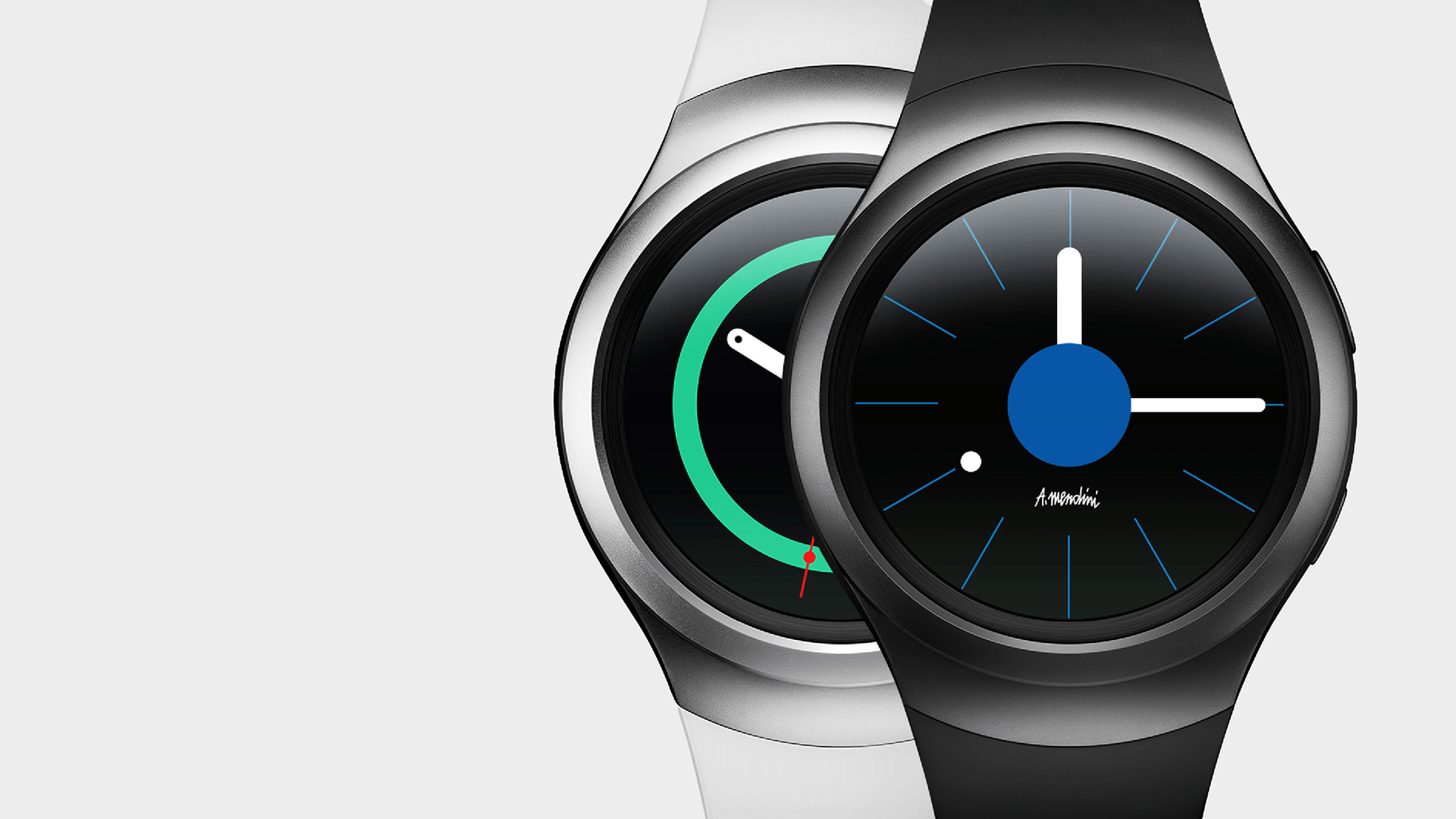
This cutting-edge smartwatch that seamlessly integrates technology and style, designed to enhance the user experience in a wearable format. Featuring a sleek, circular design with a vibrant Super AMOLED display, the Galaxy Gear S2 combines functionality with fashion, making it a versatile accessory for both casual and professional settings. It offers a range of features, including fitness tracking, customizable watch faces, and notifications, allowing users to stay connected while on the go. The device also incorporates an intuitive rotating bezel for easy navigation, positioning it as a standout choice in the competitive smartwatch market. With its robust performance and elegant aesthetics, the Galaxy Gear S2 represents a significant step forward in wearable technology.
Challenge
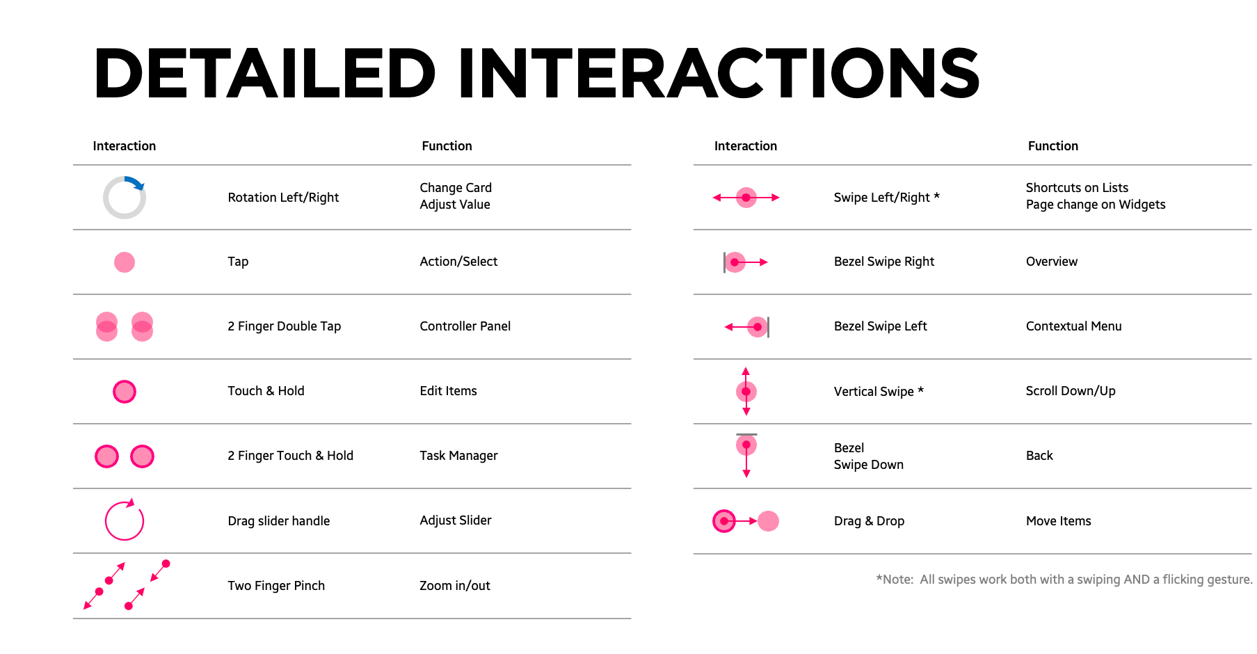
Combining the new rotating bezel interaction with touch and back button interactions, the challenge was to create seamless, intuitive interactions encompassing all three main elements.
Contribution
My involvement with this project was 0-1, from initial concept, research, and final projection. I led the UI design system, documenting key screen layouts, typography, and color into design guidelines. The team developed the prototype and UX before working with the production team to deploy this product.
The biggest contribution is the home screen architecture for Samsung's watch wearable. It is still being implemented today.
The biggest contribution is the home screen architecture for Samsung's watch wearable. It is still being implemented today.
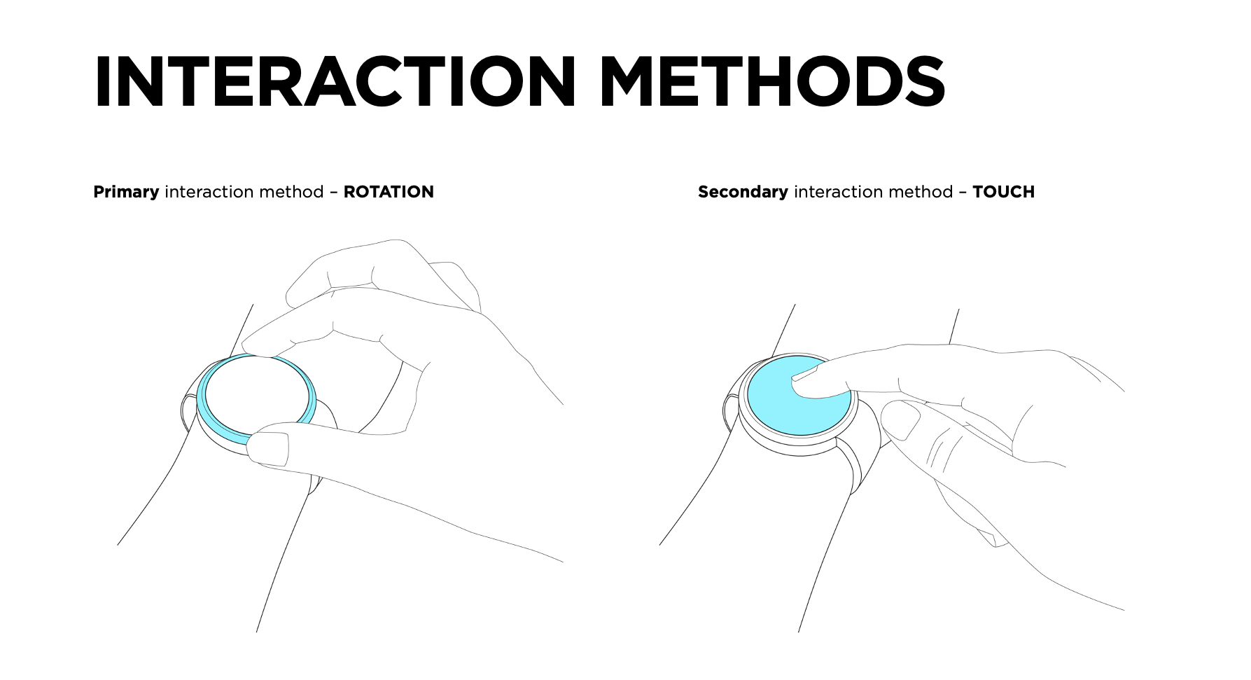
The primary method of interaction on the watch is the rotating hardware bezel ring, designed for both precision and ease of use. This intuitive control mechanism allows users to navigate through content smoothly without obstructing the display with their fingers, ensuring an uninterrupted viewing experience. Unlike traditional touchscreen navigation, which can be cumbersome on a small display, the bezel offers a tactile, effortless way to scroll through menus, adjust settings, and access key features. Its versatility enhances both usability and accessibility, making interactions more fluid while reducing accidental inputs. By integrating this unique hardware element, the watch delivers a seamless and refined user experience that feels both natural and responsive.
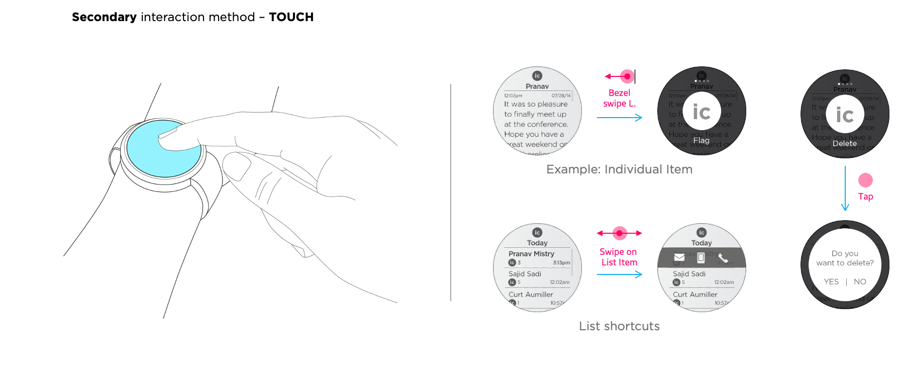
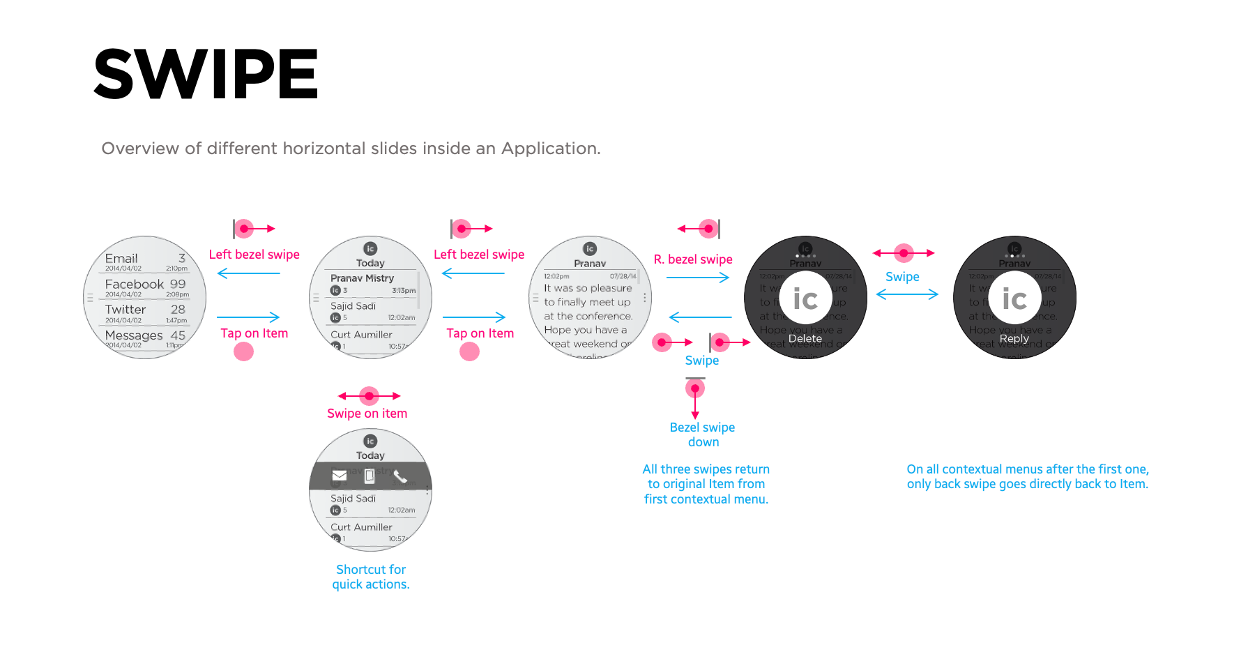
The watch’s secondary interaction method is its touchscreen, enabling more precise selections and deeper control. While the rotating bezel streamlines navigation, the touchscreen allows users to tap, swipe, and interact directly with content, making tasks like text input, app selection, and detailed adjustments more intuitive. This combination of touch and hardware interaction creates a seamless and flexible user experience, catering to both quick navigation and more in-depth controls when needed. Method

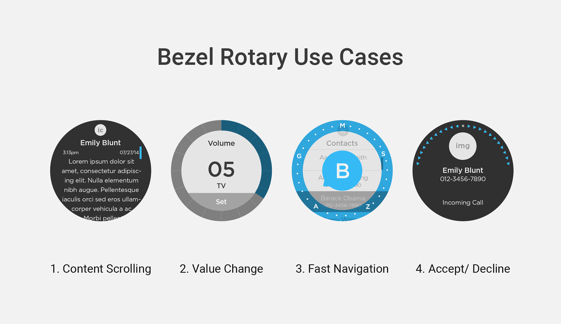
Defining the Use Cases
The average adult fingertip is 16-20mm wide, while watch screens are typically 40-44mm, often leading to screen coverage during interaction. This makes precise touch, navigation, and handling long content challenging. To address this, we developed and defined an effective use of the rotary dial for better control.
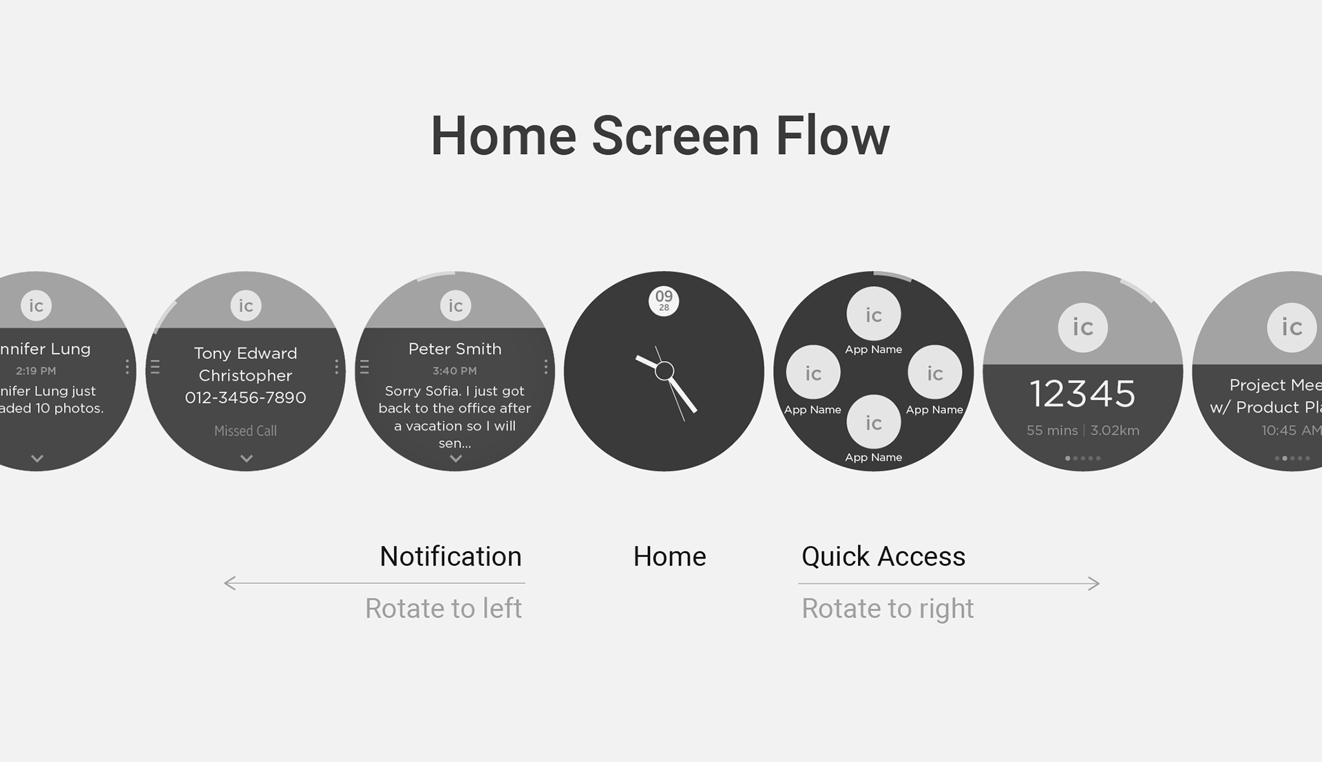
Home Screen Architecture
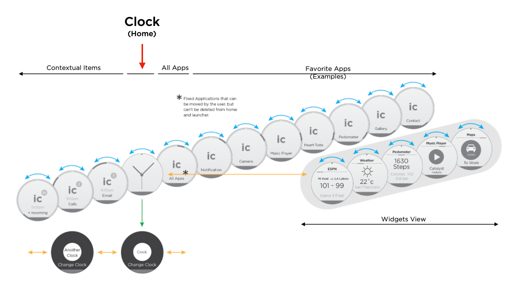
HOME SCREEN ARCHITECTURE
Our approach centered around making the watch face the home screen, providing a natural and intuitive starting point. Rotating the bezel to the left reveals a dynamic stream of live updates, including app notifications, call history, and emails—ensuring quick access to ongoing and incoming information. Rotating to the right brings up the all-apps view and a customizable widget lineup, where widgets continuously update with relevant data such as health tracking, weather, and more.
The consistent placement of widgets allows users to rely on precise bezel clicks to access their preferred tools instantly. Tapping on the clock or any app provides deeper access to settings, detailed information, and advanced features, making navigation seamless and efficient.
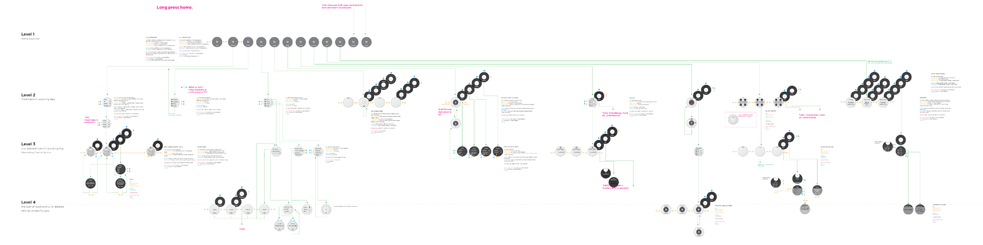
Complete Wireframe
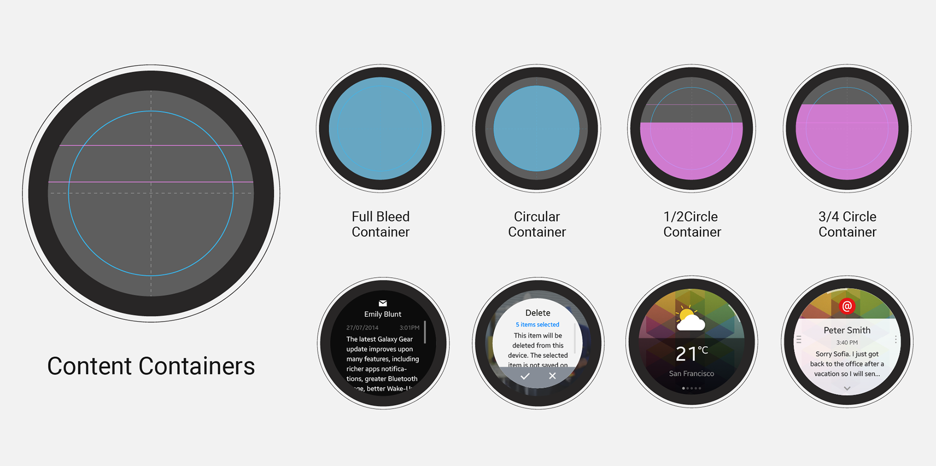
Designing Circular UI System
After mapping the user flow, I focused on designing the structural components with two main goals: maximizing content legibility on the small screen and leveraging the unique circular shape. The key design principles were to prioritize essential information at the center of the screen and to incorporate distinctive shapes tailored to specific scenarios.
Grid system
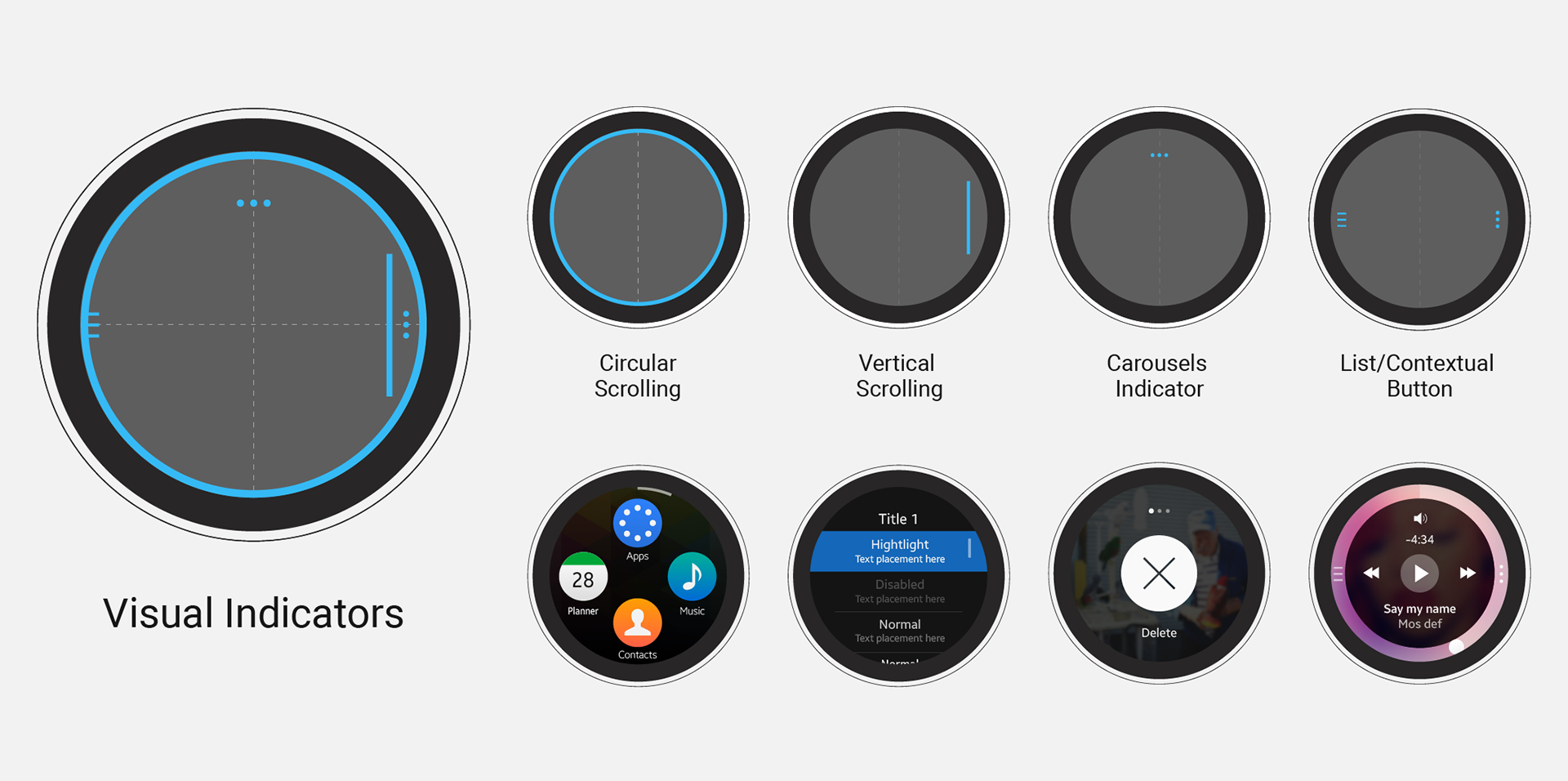
Contextual Menu and Scroll indicators
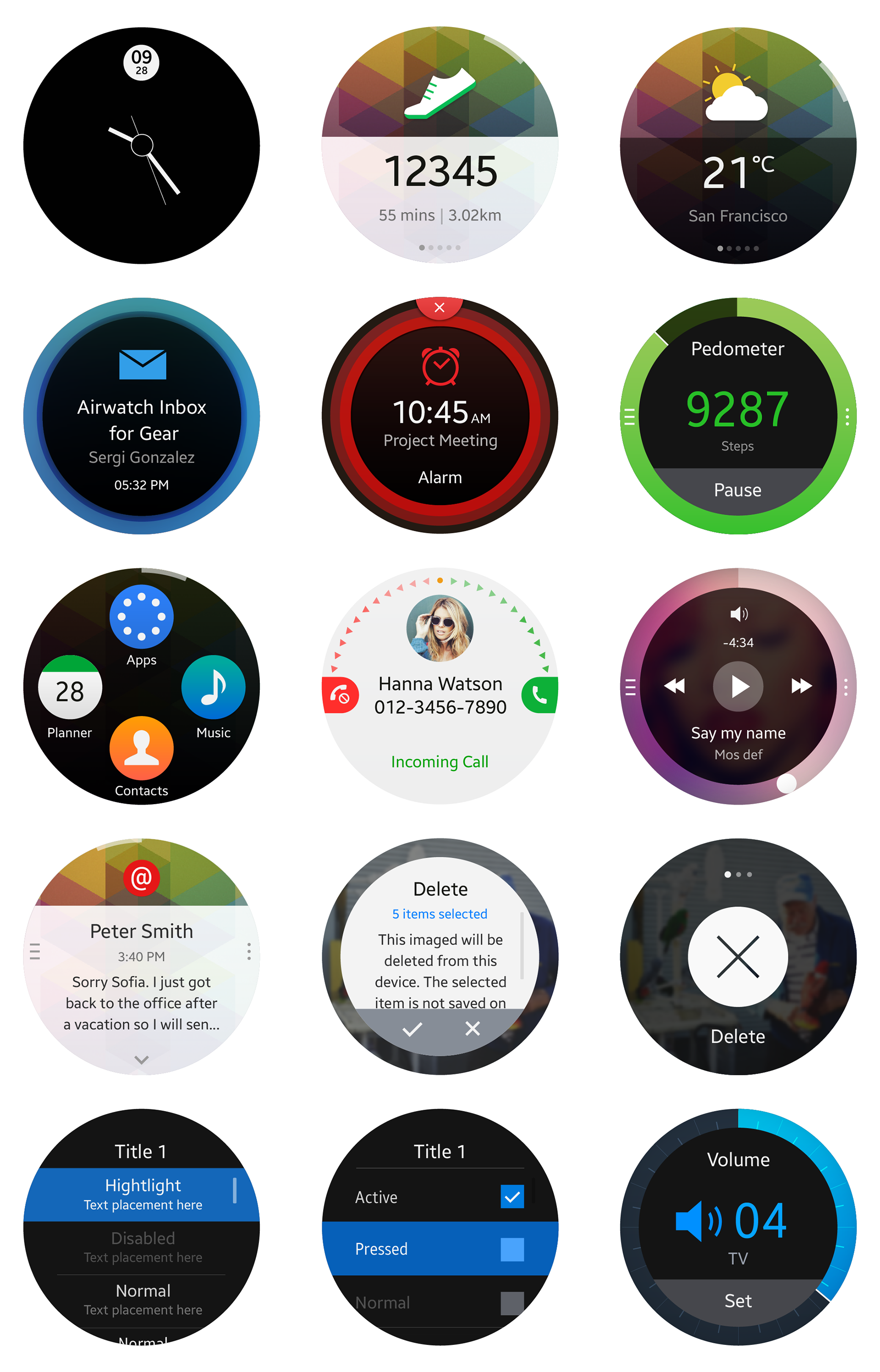
GUI Designs
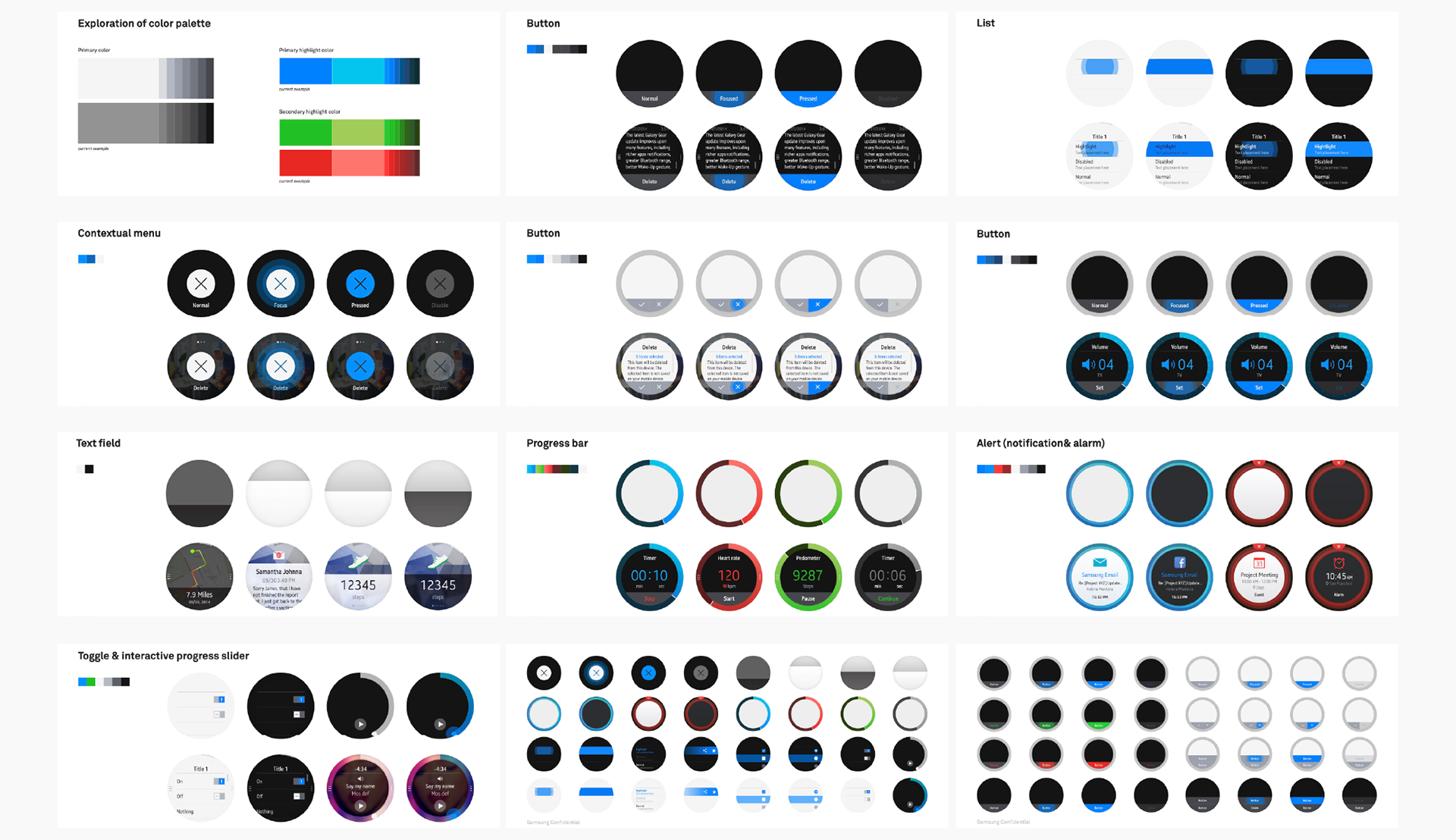
Design Systems
UI on Prototype Rendering